UX Research
Interaction Design
WELLORY
A personalised nutrition app design simplifying grocery shopping and meal planning for individuals with dietary restrictions and allergies.
A personalised nutrition app design simplifying grocery shopping and meal planning for individuals with dietary restrictions and allergies.
Prototype:
Role:
UX Researcher & Interaction Designer
Course:
SI 582: Interactive Design
Project Duration :
3 months
Objective
My goal was to architect and prototype a digital health solution that prioritizes user data privacy, inclusive accessibility, and a positive social footprint.
Demonstrate a comprehensive understanding of user experience design principles and their application in creating effective and user-centered products
My goal was to architect and prototype a digital health solution that prioritizes user data privacy, inclusive accessibility, and a positive social footprint.
Demonstrate a comprehensive understanding of user experience design principles and their application in creating effective and user-centered products
outcome
This project strengthened my understanding of user research best practices, including conducting and analyzing interviews, heuristic evaluations, usability testing and developing personas and scenarios.
It also provided extensive practice in presenting work and engaging in continuous feedback exchanges, both during and outside of structured class time.
This project strengthened my understanding of user research best practices, including conducting and analyzing interviews, heuristic evaluations, usability testing and developing personas and scenarios.
It also provided extensive practice in presenting work and engaging in continuous feedback exchanges, both during and outside of structured class time.
Challenges
This project was completed independently, so while there were structured opportunities for in-class feedback, much of the critique had to be sought proactively beyond the classroom.
Additionally, learning Figma for high-fidelity prototyping was not not formally covered, which introduced a learning curve - but one I was able to adapt to quickly
Tools
Figma
Miro
Sheets (interview/usability analysis)
challenges
This project was completed independently, so while there were structured opportunities for in-class feedback, much of the critique had to be sought proactively beyond the classroom.
Additionally, learning Figma for high-fidelity prototyping was not not formally covered, which introduced a learning curve - but one I was able to adapt to quickly
tools
Figma
Sheets (interview/usability analysis)

DISCOVERY: USER INTERVIEWS, COMPETITIVE ANALYSIS & PERSONAS
I walked through the typical customer flow for a person with dietary restrictions:
Onboarding —> Personalization —> Product Search —> Barcode Verification —> Store Availability Check —> Checkout
Key Usability Issues Surfaced, Existing Apps:
Lack personalization of Dietary preferences.
Don't support grocery and allergy preferences.
Make meal planning frustrating.
📍These issues lead to poor food choices, stress and unmotivated users
Problem Statement: Grocery shopping for individuals with allergies or dietary restrictions is a complex, frustrating and often overwhelming experience. The goal was to create a tool that moves beyond the limitations of existing nutrition apps, which often lack deep personalization and make meal planning frustrating.
Competitive Analysis:
I walked through the typical customer flow for a person with dietary restrictions:
Onboarding —> Personalization —> Product Search —> Barcode Verification —> Store Availability Check —> Checkout
Key Usability Issues Surfaced, Existing Apps:
Lack personalization of Dietary preferences.
Don't support grocery and allergy preferences.
Make meal planning frustrating.
📍These issues lead to poor food choices, stress and unmotivated users
Problem Statement: Grocery shopping for individuals with allergies or dietary restrictions is a complex, frustrating and often overwhelming experience. The goal was to create a tool that moves beyond the limitations of existing nutrition apps, which often lack deep personalization and make meal planning frustrating.
Competitive Analysis:


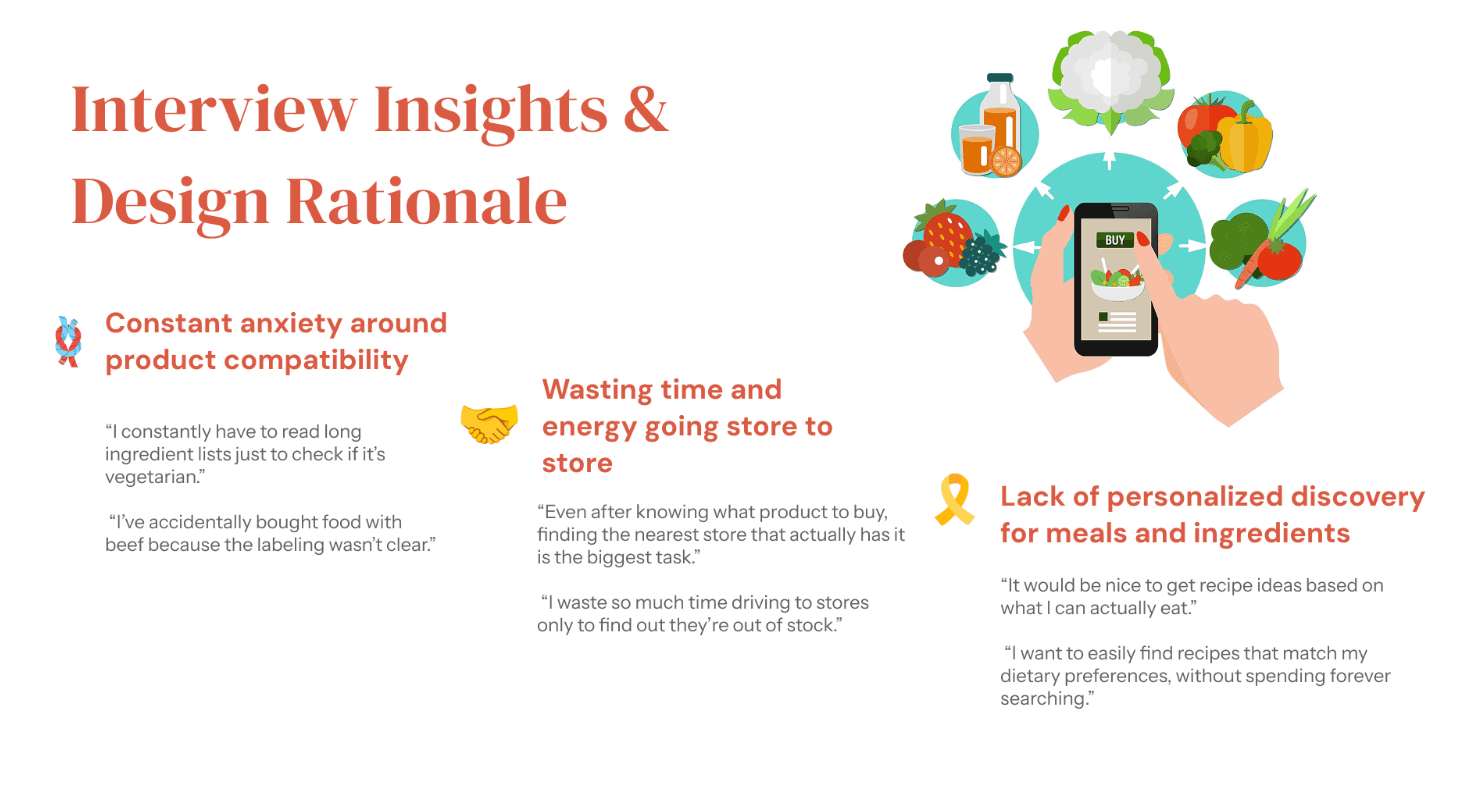
DEFINING THE SOLUTION:
The design opportunity was to create a comprehensive, supportive platform that minimizes friction in the dietary-restricted shopping experience.
Wellory aims to provide personalized nutrition for users by:
Instantly verifying product compatibility via a barcode scanner.
Showing real-time availability in nearby stores.
Suggesting recipes based on user preferences and allowing direct purchase of ingredients.
Building a community of users who share and discover food solutions.
The design opportunity was to create a comprehensive, supportive platform that minimizes friction in the dietary-restricted shopping experience.
Wellory aims to provide personalized nutrition for users by:
Instantly verifying product compatibility via a barcode scanner.
Showing real-time availability in nearby stores.
Suggesting recipes based on user preferences and allowing direct purchase of ingredients.
Building a community of users who share and discover food solutions.

DESIGN PROCESS AND ITERATION:
Paper Prototype: After identifying the main functions I referenced existing apps as well as the functional flow of the app to determine the approximate functionality of each page. My initial idea was to make each page as functional as possible and reduce the number of unnecessary pages, and at the same time I once again clarified the purpose of each function and reduced the number of redundant functions that the app had.
Paper Prototype: After identifying the main functions I referenced existing apps as well as the functional flow of the app to determine the approximate functionality of each page. My initial idea was to make each page as functional as possible and reduce the number of unnecessary pages, and at the same time I once again clarified the purpose of each function and reduced the number of redundant functions that the app had.
Wireframes: At this stage I systematically graded and distinguished the functionality on each page, grouping some features into interactions and buttons. I also refined the visuals to ensure a consistent flow between different pages.
Wireframes: At this stage I systematically graded and distinguished the functionality on each page, grouping some features into interactions and buttons. I also refined the visuals to ensure a consistent flow between different pages.


USABILITY TESTING & ITERATION
USABILITY TESTING & ITERATION
Usability testing was conducted with multiple users, moving from low-fidelity (Lo-Fi) to high-fidelity (Hi-Fi) prototypes.
Testing Goals:
Identify pain points in product compatibility verification.
Evaluate the clarity and efficiency of the navigation flow, especially regarding store location.
Collect feedback on the personalization features (recipes and product suggestions).
Iterating on the Designs
Insights from testing highlighted the need for more context-rich feedback and a more efficient navigation flow. I refined my prototype in Figma to address these themes and prepare the high-fidelity design.
Key Updates:
Usability testing was conducted with multiple users, moving from low-fidelity (Lo-Fi) to high-fidelity (Hi-Fi) prototypes.
Testing Goals:
Identify pain points in product compatibility verification.
Evaluate the clarity and efficiency of the navigation flow, especially regarding store location.
Collect feedback on the personalization features (recipes and product suggestions).
Iterating on the Designs
Insights from testing highlighted the need for more context-rich feedback and a more efficient navigation flow. I refined my prototype in Figma to address these themes and prepare the high-fidelity design.


